Thursday, 29 March 2012

Sleep effect from video

This is the initial clip before edited. We wanted to add an effect that makes the artist look like he's falling asleep in to his dream.


We selected the matrox effect folder and in their was soft focus in which had a variety of different effects.


After selecting soft focus we were giving a variety of effects and after looking through them, we found the 'In and out of focus' effect, which really made a big difference to our video and made it look more proffesional


Tuesday, 27 March 2012

Summary of medium conventions

Following my research of the conventions of the folk genre, i have applied the conventions to my production pieces and made them more appealing to my target audience. I produced my music video, digipak and magazine advertisement based on the research of the conventions, I aimed to apply conventional iconographic shots in the mise en scene of my music video, digipak and poster to keep to the conventions of the genre so the audience can recognise what the artist is representing. For the music video the location of the woodlands and fields applied to the conventions of a traditional folk music video, the outfit was appropriate to the conventions as he wore relaxed clothing, wearing a red checkered shirt connoted love, black jeans and scruffy shoes, as a conventional folk artist would. The video features the conventional relaxed approach with picturest shots of the conventional location. The video itself isnt conventional, its an abstract narrative video, with surreal shots, not a conventional video for folk.

I decided on my front cover because i thought the setting of the artist in the middle of the field really captured the mise en scene and also the negative space of the sky allowed me to put text in which you could clearly see. I put the font in an viking style writing as we decided our artist was from Scandinavia and also put his first in black because black connotes pain and darkness and red to represent love and lust. It has the conventions of the image of the artist and his name as the title but doesn't have the conventional album name and the reason i didn't want it to have that is because i wanted it to be simple and not based on just one song.

I chose the back cover image because it fits in nicely with the front cover as they feature the same setting and the artist looking a certain way (keeping continuity), i also managed to make the crop field end at the same place the front covers did to make it look more professional. It features the conventions of the mise en scene of nature and the song titles with song timings as well as the essential bar code. The song titles were done in a dark red to stand out from the sky and also connote love.
The spine features the artists name and an image of the artist both conventions of a digipak and also features iconographic shot of the artist walking through nature which is conventional of the chosen genre. It is in black and white with the artists second name in red to keep colour motif continuity with the whole of the digipak. The image came from an photograph i took whilst filming and i cropped it down to fit in to the spine size.

Both inside covers are in black and white to keep the colour motif continuity going and both feature the artist in iconographic backgrounds that represent the chosen genre of nature. The first inside cover is of him walking through the woodland with his guitar, both features of the iconographic of the genre. The second image is just of his guitar on it's own in the woodlands. It features the the guitar which is conventional within the genre and trees which is an iconographic shot of nature and represent folk. Both the discs are done in black and white to keep continuety of the colour motif. Both discs feature trees within the mise en scene which represent nature and relaxasation. Trees are also iconographic to the genre of folk.

I decided on this picture for my magazine advertisement as the mise en scene features the iconographic shots of trees that represent the genre. The advertisement also makes it obvious that he's an folk artist, with the clothes he's wearing and the mise en scene. I edited the picture first, cropping the side and the top off. I also drained the colour from the image giving it an old style look. The mise en scene captures the iconographic shots of folk and nature, capturing the trees and woodland area. It features the conventional album title, artist title, release date and artists website. The font is in capitals with the artists and album name in bold. The writing is quite difficult to see as it merges in to the background, making it harsh on the eye.


Friday, 23 March 2012

Artist promotion

Every artist needs promotion so i decided to edit some of my advertisements on places you would see it advertised.


Advertisement on You Tube
Artist cover photo for Itunes

Advertisement for album on billboard


Artist promoting himself through himself

Advert in Uncut magazine. This is the magazine he would be published in, he fits the conventionons for a folk magazine.

Vinyl advertisement

Magazine Advertisement


I decided on this picture for my magazine advertisement as the mise en scene features the iconographic shots of trees that represent the genre. The advertisement also makes it obvious that he's an folk artist, with the clothes he's wearing and the mise en scene. I edited the picture first, cropping the side and the top off. I also drained the colour from the image giving it an old style look. The mise en scene captures the iconographic shots of folk and nature, capturing the trees and woodland area. It features the conventional album title, artist title, release date and artists website. The font is in capitals with the artists and album name in bold. The writing is quite difficult to see as it merges in to the background, making it harsh on the eye.


                                               GoAnimate.com: Audience feedback by s0011622


Magazine poster drafts

I edited the picture first, cropping the side and the top off. I also drained the colour from the image giving it an old style look. The mise en scene captures the iconographic shots of folk and nature, capturing the trees and woodland area. It features the conventional album title, artist title, release date and artists website. The font is in capitals with the artists and album name in bold. The  writing is quite difficult to see as it merges in to the background, making it harsh on the eye.

This close up shot features the artist looking down at the ground, maybe not creating much interaction with the audience. I drained the colour from the original image to give it an old style look which fits in to the genre of folk. It features the conventional artist title in bold writing, with 'Jakob' in black and 'Bjorn' in a dark red colour and the conventional release date with the artists image. I wanted to do a poster very simple and basic which gives the audience the information they need but sometimes the audience want to know more information like links and album names.


This image was taken against a white background with harsh lighting against it, creating the shadow. I edited the image and put it into black and white to put more focus on to the coloured text and main image. It features the conventional artist in bold red connoting the album is about love. The album name is underneath that and in black not standing out with further information telling you its his debut album. Theres conventional links to pre order on his website and the release date at the bottom of the page. It features the less conventional quotations from the magazines he would involved in and their rating of the album. The artist is looking straight at the camera creating interaction with his target audience.                                       

This is an image from my digipak and i thought i'd try edit it in a portrait format to create a magazine advertisement. It features the conventional artist on the poster as well as the title of the artist and album. Also the release date of the artist. The blue sky allowed me to apply visible red coloured text on to it which would be easily visible bringing focus on the conventions. It doesnt look enough like a poster advertisement for a music digipak and the audience wouldnt be able to recognise what it's advertising.

This image features the artist to the right of the poster, looking straight at the camera creating interaction with the audience. His clothing style represents his genre of music and his image. He dresses casually and relaxed, showing he's not to bothered about his look and more about the music. As the background is plain back in focuses more on the artist and contrasts against the white text alongside him.   The font is in capitals and not in bold making it easy on the eye. It features the conventional artist name which is the biggest text to make the audience aware, underneath is the album title and at the bottom is information that it's out now as well as links to the website.

Third photo shoot for magazine advertisement

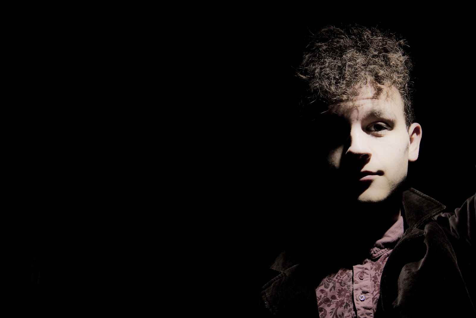
For this photo shoot i placed my artist against a black background and put him to one side so i could apply white text in the space. It features the artist dressed in the conventional stylish clothing and looks straight at the camera to create interaction with the camera.


Wednesday, 21 March 2012

Second photo shoot for poster

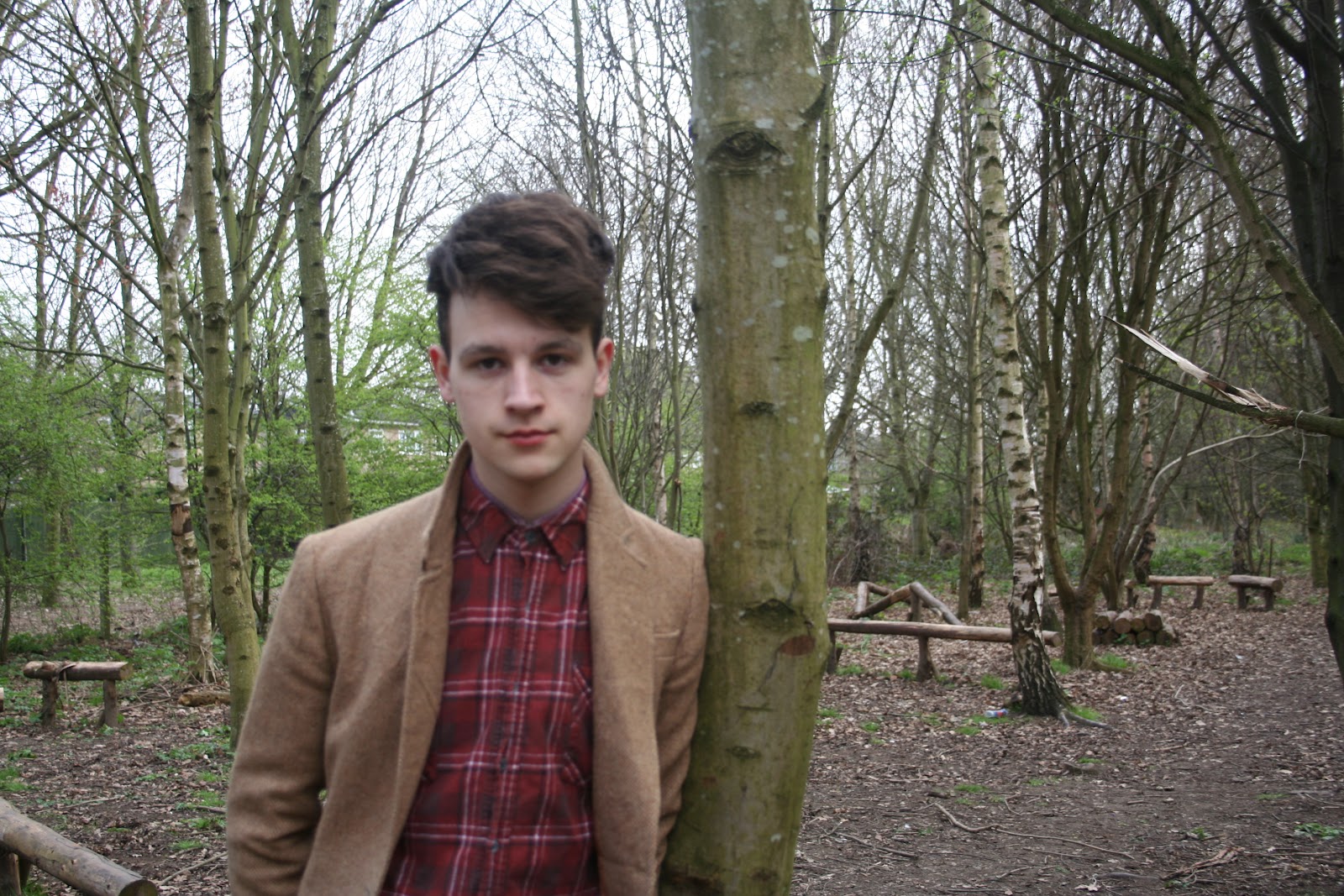
These photographs are part of my second photo shoot for my artists magazine advertisement. I decided to photograph in a woodlands, so i would capture the mise en scene of nature (Trees, leaves etc) which represent the genre of folk. I took a selection of photographs from a variety of angles (Close ups, mid shots, long shots) so i had a selection to choose from and edit. I made the artist wear smart, presentable clothing that represent him as an artist and represent his music genre.