Thursday, 29 March 2012
Final adobe print screen

This is a print screen of how our final music video looks on the time line on Adobe Premier Pro. You can see where we have edited sections of the film and how much shots we used to make it come together.
Wolf clone
For the scene in which three wolfs appear on the screen, we needed to find a way of making one person appear three times in the same shot. We kept the camera completely still and made the actor walk to different positions and stand still. Once we uploaded the shots, this is how we managed to edit it.

Select effects and then open the matrox folder

In the matrox folder select 'Matrox Advanced DVE's' and that will take you to the crop selection.

Once there you can select which part of the image you want to crop and where you want to crop it. Once cropped you can preview your shot and see if its suitable. Once suitable press OK and drag each separate layer on to one another to create the effect.
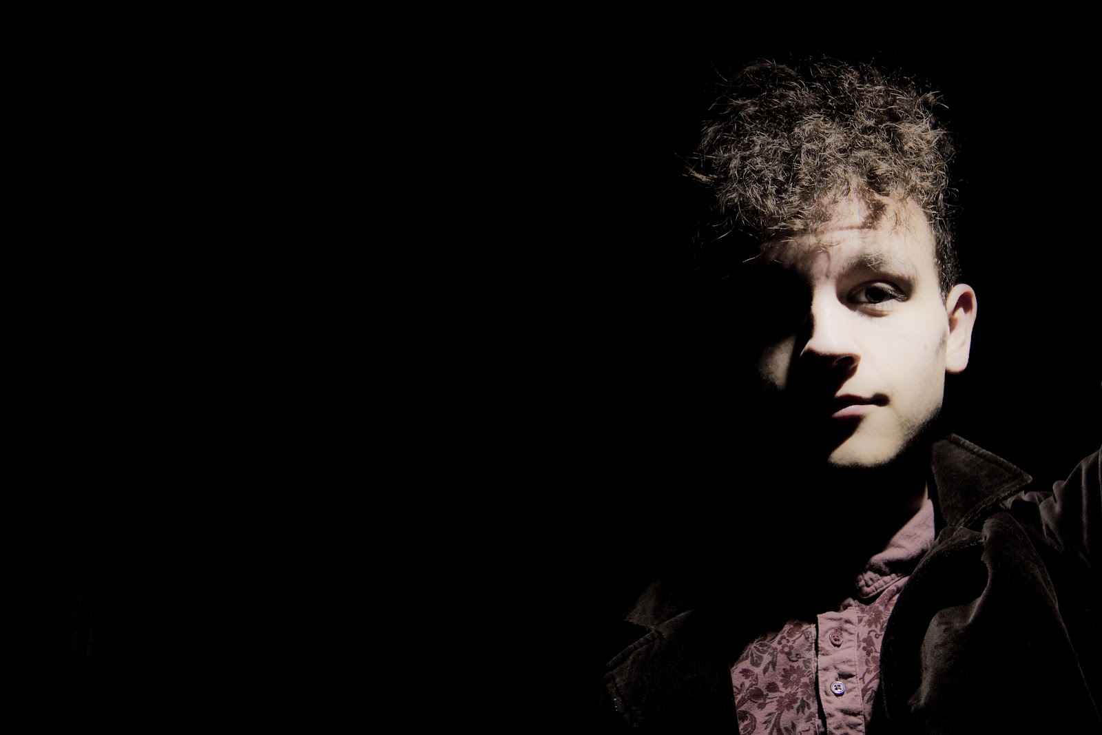
Sleep effect from video
This is the initial clip before edited. We wanted to add an effect that makes the artist look like he's falling asleep in to his dream.

We selected the matrox effect folder and in their was soft focus in which had a variety of different effects.

After selecting soft focus we were giving a variety of effects and after looking through them, we found the 'In and out of focus' effect, which really made a big difference to our video and made it look more proffesional
Tuesday, 27 March 2012
Summary of medium conventions
Following my research of the conventions of the folk genre, i have applied the conventions to my production pieces and made them more appealing to my target audience. I produced my music video, digipak and magazine advertisement based on the research of the conventions, I aimed to apply conventional iconographic shots in the mise en scene of my music video, digipak and poster to keep to the conventions of the genre so the audience can recognise what the artist is representing. For the music video the location of the woodlands and fields applied to the conventions of a traditional folk music video, the outfit was appropriate to the conventions as he wore relaxed clothing, wearing a red checkered shirt connoted love, black jeans and scruffy shoes, as a conventional folk artist would. The video features the conventional relaxed approach with picturest shots of the conventional location. The video itself isnt conventional, its an abstract narrative video, with surreal shots, not a conventional video for folk.
I decided on my front cover because i thought the setting of the artist in the middle of the field really captured the mise en scene and also the negative space of the sky allowed me to put text in which you could clearly see. I put the font in an viking style writing as we decided our artist was from Scandinavia and also put his first in black because black connotes pain and darkness and red to represent love and lust. It has the conventions of the image of the artist and his name as the title but doesn't have the conventional album name and the reason i didn't want it to have that is because i wanted it to be simple and not based on just one song.
The spine features the artists name and an image of the artist both conventions of a digipak and also features iconographic shot of the artist walking through nature which is conventional of the chosen genre. It is in black and white with the artists second name in red to keep colour motif continuity with the whole of the digipak. The image came from an photograph i took whilst filming and i cropped it down to fit in to the spine size.
Both inside covers are in black and white to keep the colour motif continuity going and both feature the artist in iconographic backgrounds that represent the chosen genre of nature. The first inside cover is of him walking through the woodland with his guitar, both features of the iconographic of the genre. The second image is just of his guitar on it's own in the woodlands. It features the the guitar which is conventional within the genre and trees which is an iconographic shot of nature and represent folk. Both the discs are done in black and white to keep continuety of the colour motif. Both discs feature trees within the mise en scene which represent nature and relaxasation. Trees are also iconographic to the genre of folk.
Both inside covers are in black and white to keep the colour motif continuity going and both feature the artist in iconographic backgrounds that represent the chosen genre of nature. The first inside cover is of him walking through the woodland with his guitar, both features of the iconographic of the genre. The second image is just of his guitar on it's own in the woodlands. It features the the guitar which is conventional within the genre and trees which is an iconographic shot of nature and represent folk. Both the discs are done in black and white to keep continuety of the colour motif. Both discs feature trees within the mise en scene which represent nature and relaxasation. Trees are also iconographic to the genre of folk.
I decided on this picture for my magazine advertisement as the mise en scene features the iconographic shots of trees that represent the genre. The advertisement also makes it obvious that he's an folk artist, with the clothes he's wearing and the mise en scene. I edited the picture first, cropping the side and the top off. I also drained the colour from the image giving it an old style look. The mise en scene captures the iconographic shots of folk and nature, capturing the trees and woodland area. It features the conventional album title, artist title, release date and artists website. The font is in capitals with the artists and album name in bold. The writing is quite difficult to see as it merges in to the background, making it harsh on the eye.
Friday, 23 March 2012
Artist promotion
Every artist needs promotion so i decided to edit some of my advertisements on places you would see it advertised.

Advertisement on You Tube

Artist cover photo for Itunes

Advertisement for album on billboard

Artist promoting himself through himself

Advert in Uncut magazine. This is the magazine he would be published in, he fits the conventionons for a folk magazine.

Vinyl advertisement
Magazine Advertisement

I decided on this picture for my magazine advertisement as the mise en scene features the iconographic shots of trees that represent the genre. The advertisement also makes it obvious that he's an folk artist, with the clothes he's wearing and the mise en scene. I edited the picture first, cropping the side and the top off. I also drained the colour from the image giving it an old style look. The mise en scene captures the iconographic shots of folk and nature, capturing the trees and woodland area. It features the conventional album title, artist title, release date and artists website. The font is in capitals with the artists and album name in bold. The writing is quite difficult to see as it merges in to the background, making it harsh on the eye.
GoAnimate.com: Audience feedback by s0011622
Magazine poster drafts

I edited the picture first, cropping the side and the top off. I also drained the colour from the image giving it an old style look. The mise en scene captures the iconographic shots of folk and nature, capturing the trees and woodland area. It features the conventional album title, artist title, release date and artists website. The font is in capitals with the artists and album name in bold. The writing is quite difficult to see as it merges in to the background, making it harsh on the eye.

This close up shot features the artist looking down at the ground, maybe not creating much interaction with the audience. I drained the colour from the original image to give it an old style look which fits in to the genre of folk. It features the conventional artist title in bold writing, with 'Jakob' in black and 'Bjorn' in a dark red colour and the conventional release date with the artists image. I wanted to do a poster very simple and basic which gives the audience the information they need but sometimes the audience want to know more information like links and album names.

This image was taken against a white background with harsh lighting against it, creating the shadow. I edited the image and put it into black and white to put more focus on to the coloured text and main image. It features the conventional artist in bold red connoting the album is about love. The album name is underneath that and in black not standing out with further information telling you its his debut album. Theres conventional links to pre order on his website and the release date at the bottom of the page. It features the less conventional quotations from the magazines he would involved in and their rating of the album. The artist is looking straight at the camera creating interaction with his target audience.

This is an image from my digipak and i thought i'd try edit it in a portrait format to create a magazine advertisement. It features the conventional artist on the poster as well as the title of the artist and album. Also the release date of the artist. The blue sky allowed me to apply visible red coloured text on to it which would be easily visible bringing focus on the conventions. It doesnt look enough like a poster advertisement for a music digipak and the audience wouldnt be able to recognise what it's advertising.

This image features the artist to the right of the poster, looking straight at the camera creating interaction with the audience. His clothing style represents his genre of music and his image. He dresses casually and relaxed, showing he's not to bothered about his look and more about the music. As the background is plain back in focuses more on the artist and contrasts against the white text alongside him. The font is in capitals and not in bold making it easy on the eye. It features the conventional artist name which is the biggest text to make the audience aware, underneath is the album title and at the bottom is information that it's out now as well as links to the website.
Third photo shoot for magazine advertisement
For this photo shoot i placed my artist against a black background and put him to one side so i could apply white text in the space. It features the artist dressed in the conventional stylish clothing and looks straight at the camera to create interaction with the camera.


Wednesday, 21 March 2012
Second photo shoot for poster
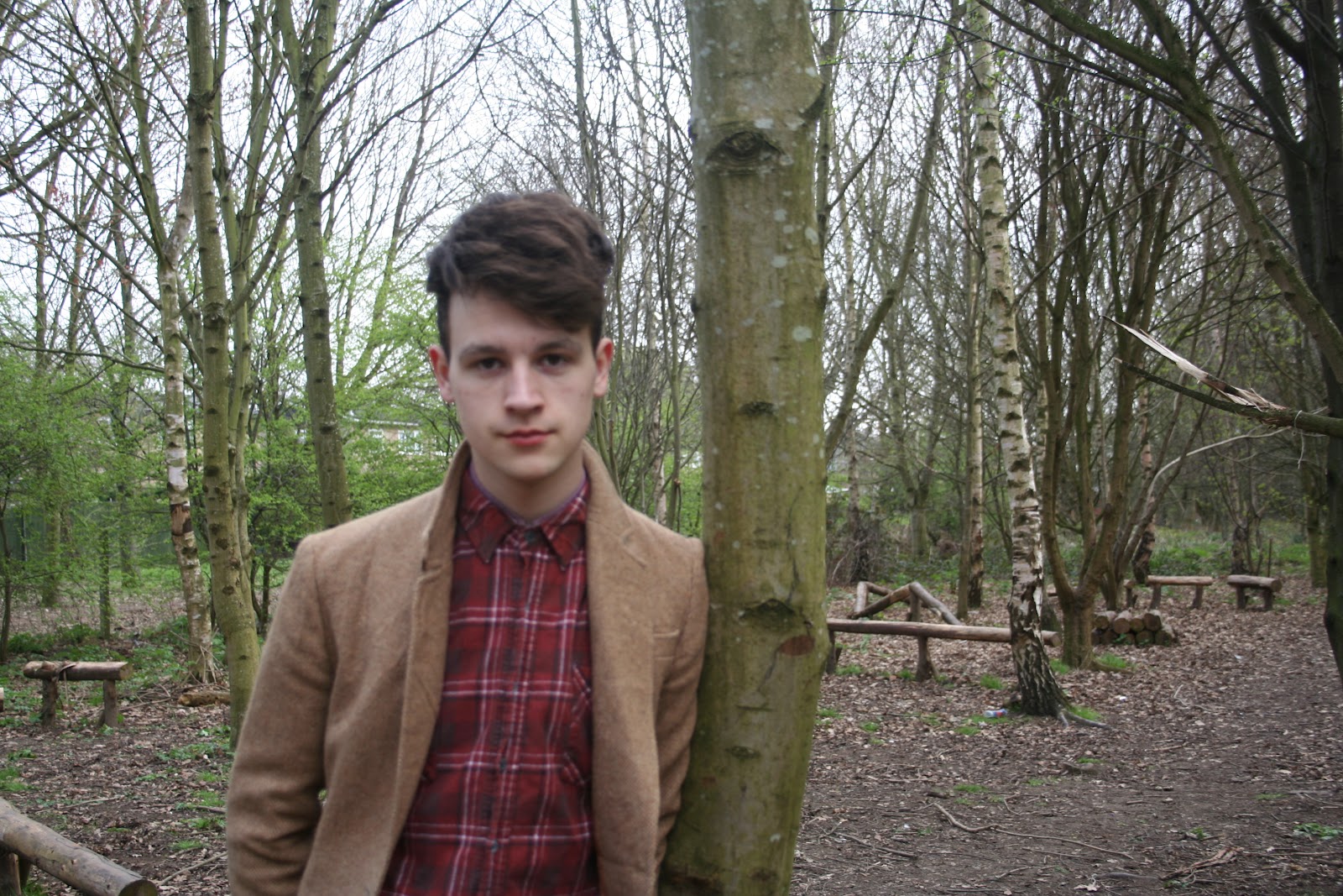
These photographs are part of my second photo shoot for my artists magazine advertisement. I decided to photograph in a woodlands, so i would capture the mise en scene of nature (Trees, leaves etc) which represent the genre of folk. I took a selection of photographs from a variety of angles (Close ups, mid shots, long shots) so i had a selection to choose from and edit. I made the artist wear smart, presentable clothing that represent him as an artist and represent his music genre.


Friday, 16 March 2012
Images taken for poster advertisment
This is the first of two or three photo shoots for my magazine advertisement. I plan on doing this amount to find the best possible image. I went for the basic shots first which feature the artist against a plain white wall so i can apply coloured text on to the negative space of the background. I did a variety of mid shots and one close up with the artist either in the middle or to the left of the composition. The artist was made to look straight at the camera, to create interaction with his niche audience. I advised him on what clothes to wear so it would fit within the genre of folk, the denim shirt, velvet blazer and hairstyle give him a unique image that would make him noticed.
 Mid shot- There's a slight issue with the shadow and the framing of this image as you can see objects to the bottom left and right sides but then can easily be cropped on photo shop.
Mid shot- This mid shot shows the artist making eye contact with the audience as well as his clothes, which indicate what genre of music he is.

Mid shot- The lighting for this shot is too dark for me and one side of his face is darker then the other. The shadows are too harsh and visible and the artist is central and i wanted him either right of the composition.

Close up- I like the close up shot but again half his face s darker then the other and the shadow is quite harsh.
Thursday, 15 March 2012
Magazine advertisment poster analysis

This is the magazine advertisement for Ben Howard's album 'Every Kingdom' released 2011.
The conventions of an advertisement poster are shown on the poster, it features the title of the artist in bold white so it catches the attention of his niche audience. It features the album title underneath the artist title giving a meaning and relevance to his songs. It also says along side the album title that it's his debut album and that tells us he's a new upcoming artist. At the bottom of the poster, the date of the release is shown to tell the audience when they can purchase the album but next too it shows you can pre-order it if you cant wait. The font is very basic and plain putting more focus on to the image itself which features the conventional picture of the artists. The image uses the cool colours of the blue water to connote the cool and relaxed genre of his album and his style. The artist silhouette shows him swimming alone in to the empty waters, its an iconographic shot as it features a natural shot of the water.
Ben Howard is signed to communication records which are an independent niche institution who cover the music genre of folk artists. This advert would mostly be seen in niche folk magazine but also in the mainstream music magazine NME as it covers a variety of music genres and promotes solo artists as much as they can.
Ben Howard would have a niche audience who are interested in the genre of folk, the You tube demographics for Ben Howard's audience would be majority male aged 25-34 but would also appeal to a student audience in social category E as Ben Howard is young and appeals to a young audience with his dress sense and style but appeals to an older audience because of his musical abilities.
This album represents the artist and his record label but also the genre of folk, the iconographic shot of him swimming through clear blue water provides the audience with a representation of the genre itself. It represents the audience as they are the ones buying these albums and the institution have to appeal to the audience so they buy the album.
Noah And The Whale

This is the album magazine advertisement for the Indie/rock band Noah And The Whales Cd/film release.
It features the conventional artist title and album name but is structured unconventionally as the album name is bolder and above the Artists name. This is because you have the conventional band image at the bottom which the audience will recognise. At the top of the page there is quotes from various mainstream magazines which rate the album, similar to a film advertisement poster. There is also the album release date as well as the record label and information about where you can download the songs. The washed out old style colour of the poster and the old style font suits the bands genre image, the information is at the top of the poster so it contrasts against the blue sky. The long grass and blue sky represent the season of spring and links to the album title 'The first day of Spring'. The lead singer is holding up a telescope and is the only member in focus, they all wear shirts which show they have a smart classy image.
Noah and the Whale are signed to independent record label 'Young&lost club'. This poster would most likely because of the genre be published in NME magazine. The artists are a mainstream Indie band who include folk and pop in their songs and have a wide range of audience. They would also feature in mainstream pop magazines as they are popular with the mainstream audience.
Noah and the Whale would have a mainstream audience who are interested in the genre of Indie/ folk and pop. The demographics for Noah and the Whale would be both sexes aged 13-24 years old in E social category E, being students.
The album poster represents the artists music and image as well as representing the record label. The genre of Indie/folk is represented with the clothes the band wears, as well as representing the young mainstream audience, the people who buy the album.
Laura Marling

This is the album advertisement for Laura Marling's album 'A creature i don't know' released
It features the conventional artist name and album title which are both in bold black writing with full stops after each syllable which is unconventional to a artist advertisement. The poster is very plain and basic and doesn't give much information away about the album, when it's out or where you can buy it. This could be because her niche audience will automatically know where to buy her album and where to get information. The main focus on this poster is the drawing in the centre of it, it looks like a woman is being held or carried by a creature she doesn't know, this links in well with the title and always gives the poster an artist piece and also makes it break the boundaries of conventional artist advertisements.
Laura Marling is a folk solo artist who is signed to WayOutWest records, a London based independent record label. This poster would feature in niche music magazines that promote solo artists, it would also appeal in NME as they include niche artists and promote them in a mainstream magazine.
Laura Marling would have a niche audience interested in the genre of acoustic folk music. She would appeal most likely to young females aged 13-24, most likely social category E as they will be students. Her audience will be niche in what they listen to and what they were as people who listen to people like Laura Marling
The poster represents the artists style, image and album as well as the institution. It represents the niche audience and their image and style and also represents abstract art involved in advertisement.
Main advertisment

This is my tour date poster for my magazine advertisement. It features the conventional artist and tour titles as well as the conventional tour dates and venues, with quotes from well know mainstream institutions. There's the conventional website links that link the audience to information to the artist. Also in the corner of the page there is the logos of social networking sites, suggesting you can follow the artist on them, keeping up to date on what's happening. Above the quotes, there is an image of the artist involved that features an iconographic image, with the mise en scene of the nature, reflecting the genre of nature. I made the background a light cream colour so that the dark titles and writing stand out, so the audience can focus on the key points.
Sunday, 11 March 2012
Tour date poster analysis

This is a band advertisment of The Maccabees tour poster. The band are featured in the poster to the left of the composition and are wearing bright clothing to make them stand out, they have been made to look like figurines to give an artistic feel to the poster, having the band is a conventional feature to a band poster and is reguarly on them. Above the image of the band is the title of the band The Maccabees and has been put in bold black font so it contrasts against the white background to stand out more. Down the right hand side is all the tour dates which tell you what day they'll be playing and what club in what city, so the audience get as much information as possible. At the bottom of the poster is information about how to buy tickets for the tour with extra information about the website and how to get in touch. All these features are conventions to the advertisment tour poster and are reguarly featured on most posters, its up to the band to make it stand out and be different.

This is a poster for folk/indie band Mumford&Sons for their UK tour. It done in th style of an old folk carving with the illustration in the middle of the poster which has the icongraphic image of trees and a field with people on the floor underneath a sign which reads 'love your ground'. The title of the band is done in a folk folk that represents the genre and also stands out from the rest of the poster. The conventional dates,times and location are underneath the image to give information for the gigs and for extra information their is links to the bands websites that lead to more information about gigs and the band in general.

This is the tour poster for folk artist Ben Howard. It features the conventions of the tour dates with information of the dates, time and place and also tells you which gigs have been sold out. The title is split up in to three columns the first is the name of the artist 'Ben Howard' which is in bold black to stand out. The next is the album and name of the tour 'Every Kingdom' which is done is a thinner black font so it doesnt take the attention away from the artists name. The third is 'UK tour dates' which is in red possibly to connote love and also allow the audience to know he's going on tour. To the right of the poster is an illustration of Ben Howard that makes the poster more artistic and also breaks the boundries as posters usually feature a digital picture of the artist instead of an illustration but this poster keeps it simple. Underneath the illustration are quotes from relevant papers and magazines that give their opinion on the tour and CD "Uniquely Brilliant" this shows the audience that it's good as it has good reviews. At the bottom of the page is details towards the website and the website will give information towards purchasing tickets and downloading songs and buying merchandice, so the tour date helps the artist more popular throughout.
Conventions of an artist advertisment
- Dates, times, and location
- Image of artist/band
- Title of band.artist
- Tour title
- Website
- Quotes
Re-filming
Today we went up to Hessle foreshore which has a woodland area similar to Millington (Our first location). We needed to re-film some certain shots that we didnt think were good enough for the final film. We spent three hours filming as much as possible, ready to edit the next day. We made sure the continuety of the clothing and props were correct. The filming went as planned but we still need a few more shots to complete the film. Overall we got a few shots to fit in to the video but we still need one more day of filming just to get a few more shots.
Subscribe to:
Posts (Atom)