Tuesday 10 April 2012

Evaluation

The form of my production is a music video, with the genre of the music video being alternative folk. The genre alternative means that it is alternative to mainstream music and alternative to the conventions of folk music. The music I used in the video breaks the boundaries of conventional folk music and is the newest form of the genre. We had the choice of either working alone or a group, I decided to work with a friend, together we produced the music video but had to produce separate research, planning and ancillary texts on our blogger (KarimSkalliA2media.blogsport.com).

Before production we had to decide on the song and genre we were going to produce the texts for. We decided on ‘Ben Howard-The Wolves’ who is a young solo alternative folk artist, we then researched his background and the folk genre, finding out the conventions for it.

The genre of our chosen genre was alternative folk music. Folk is a historical and traditional music genre that has a niche following. Folk music is conventionally a solo artist playing an acoustic guitar but as time has gone by the genre has expanded and more bands and duos have become well known for their unconventional ways towards the genre. Folk is a not mainstream music genre and the artists are very unconventional to the mainstream, folk artists wear unique clothing to gives themselves an identity and represent the genre in which they are involved in.

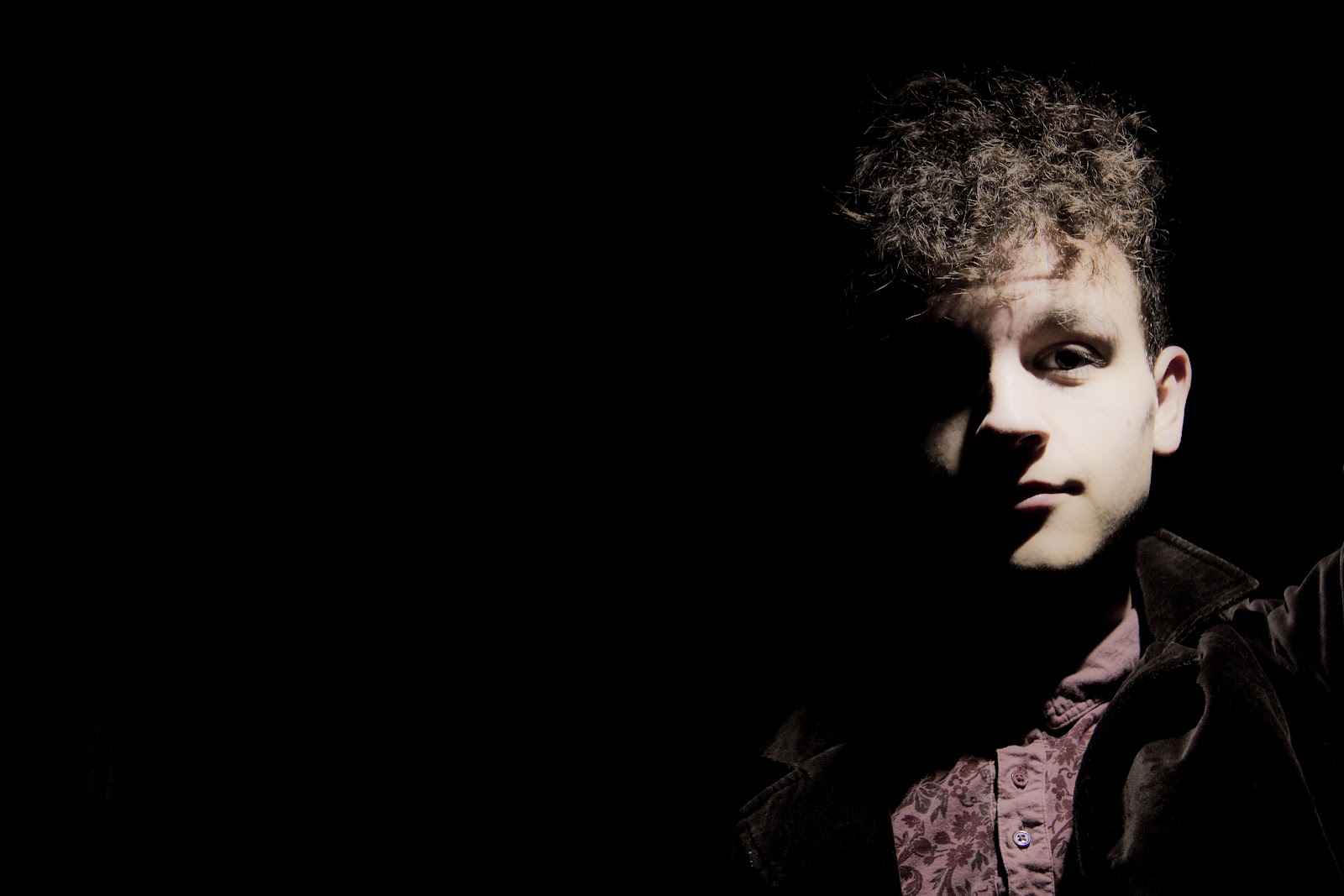
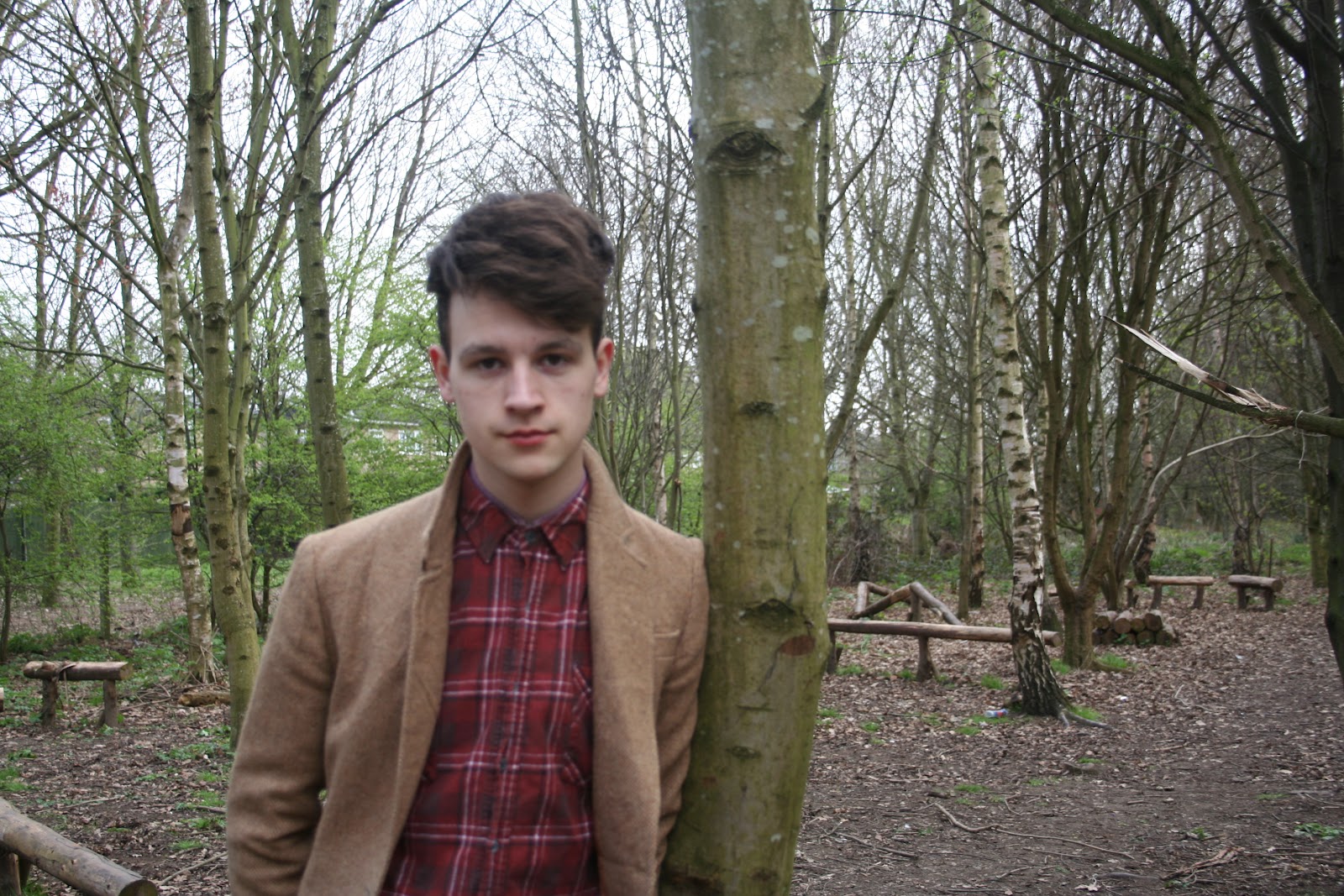
My productions follow the forms and conventions of the music video genre, digi-pak and magazine advertisement, especially in terms of the ‘alternative folk’ conventions. The solo artist ‘Jakob Bjorn’ is the fictional artist I created for all my texts; he is featured as the main focus and star of the music video. This is conventional of music videos as solo artists are mainly just seen on their own in their own music videos. Conventional to solo artist productions, the artist is the main and only focus on all three production pieces. The artist is represented as ‘Individual’, ‘stylish’ and ‘appropriately styled’ through the costume in the mise en scene in which he wears a red chequered shirt (To connote love) with black jeans and messy hair which is conventional to a folk artist. My music video, however, is not completely conventional and features some unconventional parts. Modern folk music videos are conventionally performance clips, whereas my music video is abstract and narrative forms but features minor performance clips with the artist strumming the guitar making it unconventional to a conventional folk music video. I wanted to involve a narrative in which featured abstract forms and one which features the artist performing on the conventional guitar. The location of the music video is very conventional to the genre as it features iconographic shots of woodland and forest areas, at the beginning of the video we used established shots of these iconographic shots to set the scene and represent the chosen genre. All music videos are post modern, borrowing ideas from other music videos. My music video is no different, I used ideas from the videos I analysed on my blogger. The first from ‘Bat for lashes- What’s a girl to do’ as we used the idea of the artist riding the bike with the animal masks making it an abstract form, in my video I used the idea of surreal animal masks and the conventional woodland setting. The other ideas we got from our research was from ‘Boy& Bear- Rabbit song’ we liked the idea of the main subject being in a surreal dream which had a narrative within it and no performance, we liked the costume mise en scene and the use of props and used the ideas in our own film by making ours an abstract form with a narrative and very little performance, unconventional to the genre.


However my digi-pak and magazine advertisement both follow the conventions of the genre. My front cover captures my artist on his bike in the middle of a corn field, looking in to the distance. The mise en scene captures the artist in his conventional relaxed folk clothing and also captures the iconographic shot of him in a corn field, conventional to the folk genre. The artist title is a large font so the audience can focus on the artist’s name (Jakob Bjorn). The cover is in black and white to connote darkness to the album and the artist title in red to represent love and lust. It has the conventional artist image, which represents his style and the genre and the artist title but not the album title, I decided against the album title as I wanted to keep the cover as basic as possible and allow the image which the conventional iconographic shots to stand out. The back cover image was chosen to keep continuity with the front cover as they feature the same setting and mise en scene as well as the artist looking the same way. It features the conventions of a digi-pak of the song titles with song timings as well as the essential bar code at the bottom of the page. The song titles were done in a dark red colour to stand out against the sky and also connote love. The song list doesn’t follow the conventional straight down list; instead I decided to put the titles at the top of the cover to make the font stand out against the sky. The spine features the artist’s title and an image of the artist, both conventions of a digi-pak. The iconographic shot of the artist walking through nature is conventional to the folk genre. It’s in black and white with the artist’s second name in red to keep colour motif continuity with the whole of the digi-pak. The image came from a photograph I took whilst filming and I cropped it down to fit in to the spine size. Both inside covers are in black and white to keep the colour motif continuity and both feature iconographic shots that represent the genre of folk. The first inside cover is of him walking through the woodland with his guitar, both conventions of the genre. The second image’s mise en scene features his guitar on it's own on the ground in the woodlands, both the guitar and the woodlands are iconographic shots and both are conventional within the genre. Both the discs are done in black and white to keep continuity with the colour motif. Both discs feature similar mise en scene which has conventional iconographic shots of trees and nature. I didn’t put the conventional title of the artist on the disc as I though the iconographic shots of the trees were enough to keep it conventional.

Furthermore for my magazine advertisement the artist is wearing conventional folk clothing with the red chequered shirt which connotes love and the tweed blazer which gives his image a unique identity. The clothes he wears represents his image and his target audience as his audience will want to dress like him and be like him. The mise en scene features conventional iconographic shots of trees within woodland, you see nature involved the majority of time within folk music and I kept to the conventions for my advertisement. The advertisement features the conventional album title, artist title, release date and artist website. All the writing is in capital letters making the information easier to read, the largest font size is the artists name, so the audience know who he is. The album title is in big as well as ‘Debut album’ letting the audience know he’s a new up and coming musician. The release date it below the artist name and gives a specific date of release. There is a website link at the bottom of the page in a small font for more information on the artists and merchandise and ticket sales. I had put coloured borders around the fonts to make them stand out against the drained background. I edited the initial image by cropping the side and the top off. I also drained the colour from the image giving it an old style look to fit more to the conventions. After completing the poster I applied it to billboards and uncut magazine (Acoustic folk magazine) to advertise my digi-pak.

I believe the combination of my main product and ancillary texts are effective as a combination. My video, digi-pak and advertisement represent the genre of folk by using conventional forms such as iconographic shots of nature. The video follows the conventions to an extent but does have abstract forms in it, whereas the ancillary texts are very conventional with the use of mise en scene and folk conventions. The locations of all three products are similar featuring the mise en scene of woodlands and forest areas, iconographic shots of the genre folk. The artist in each product is wearing similar clothing that represents the genre and represents his style, working effectively alongside one another. Each work together to promote the artist and each use the same conventions to appeal to the niche audience.

Getting audience feedback throughout the production and after the production was very important. I asked for feedback from my audience as they are the ones consuming the products. Knowing my target audience would be niche because of the genre, I was able to shape the questions around them and find out what they wanted. I made polls available to the general public, I asked my classmates and friends to answer honestly and also put links to my blogger on the social network sites www.Facebook.com and www.Twitter.com to receive a variety of votes from a variety of different people who have different views. I asked five questions that I thought would help us work out our target audience and to work out what they wanted to see. The questions were “What social group do you belong to?" in which the most votes were for social categories E, that being students and this allowed us to know our target audience were young. "What subjects do you study?"  Most votes were for the creative subjects. This provides me with the answer that our target audience will be creative students that are interested in artistic and abstract features rather then the conventional performance form. "What type of music video do you prefer?" Although narrative received the most votes and abstract came second, I believe abstract form with aspects of narrative will appeal more to our target audience because the majority are young creative art students. “What age group do you belong to? I wanted to appeal to a young audience who were students and in social category E, so were relieved that the majority voted for the '16-19' category. “What is your Gender?” I didn't know what to expect for this answer because Folk is popular with both genders but the polls say males preferred it. The final question "what music video form do you prefer?" I wanted to appeal to a young audience who were students and in social category E, so were relieved that the majority voted for the '16-19' category.  From the analysis of my polls I have managed to recognise my specific target audience. I now know what the audience will want to see in my production pieces and what will appeal to the majority of them. The polls told me that the social class of my target audience will be those from Category E; these are students and graduates that are still in education. This also gave me evidence that my target audience will be young, the majority of the respondents were 16-19 years old, those who are in individual and have developed a sense of what they like in music and interested in the music scene. From my social class poll and age poll, I realised that my target audience were young and set up a poll to determine what courses they studied.  Most respondents studied creative art subjects and this steered me towards the next question in my poll which was to find what style of music video they preferred because their opinions matter given this is their field and there creative people with creative minds. The majority chose the conventional folk video style narrative but in second came abstract which is unconventional for the folk genre. My target audience is balanced between male and female which is good as it makes the audience vaster and appeals to a wider audience. So my audience will be students of both genders who have a creative side and like a story with some intelligence behind it and appreciate diversity and a non conventional approach.  


After the music video was completed, we wrote down some questions on Microsoft Word and printed ten sheets out, five each for boys and girls aged 16-19. We asked “Did you enjoy the music video” and all said yes as it fitted with the specific genre. We then asked “What did you like about it?” and had a mix of feedback, some said the location and the vintage feel, some liked how it fitted with the genre and how relaxing it was and others liked the effects used. As the video was an abstract narrative video we wanted to know if the audience understood what it was about “Did you understand the music video?” The majority understood it but a small amount understood but not as much as they would have liked.  The final question was “What could have been improved” Most thought it was good and didn’t need improving but others said that we had issues with the compressed framing problems and others said we could have made the narrative more clearer.


Like my foundation year I stored all my coursework, pre-production, production and post production on www.blogger.com which is website run by www.google.com . Blogger is easy to use and free and really useful when it comes down to publishing posts. Blogger allowed me to organise my work and put it in order, making it easier for me to keep work safe and for it not to be misplaced or lost. I have previously lost a lot of work on other digital technology like memory sticks so blogger came in handy saving my work. Blogger allowed me to upload photos from www.google.com/images in which I use for my digipak front cover analysis and let me upload videos from my music video and videos from www.youtube.com to analyse.

For my research, planning and evaluation stages I used new technology to help me progress and develop my certain products and used it to further my final research analysis, planning and evaluation stages. For my pre production I relied on the use of web 2.0 to find out information about my artist using www.wikepedia.com which is an Internet-based encyclopedia but is known for having unreliable sources, so I had to check other sources to check the reliability of the information and possibly change it to make my text more professional. Another web 2.0 site that helped me was www.youtube.com, it helped me in my music video research as I could easily watch any video I wanted and made it easier to choose and analyse. I copied my chosen videos HTML code and paste them on to my blog to analyse and be viewable to my audience.  This made it easier for me to analyse the video as I could easily access it.

During my pre-production of my production work, I drew up a drawn storyboard of my music video as well as the drafts for my ancillary texts. I used the traditional pen and paper to draw up my storyboards and used a scanner which saved the images as a jpg file, which made it easier for me to then upload the images to blogger. My drawings were done in pencil and were too light and not visible, so I opened them on Photoshop and increased the contrast making it easier to see. The use of new technology allowed me to improve my light drawings and my overall production. The next step was to take pictures of each separate storyboard square and upload them on to the laptops to create an animatic. I used my own camera, a Canon 350d and uploaded the images on to Adobe premier pro CS3 in which I applied to the time line, we then imported our chosen song and put the photos together creating our eventual animatic.

I used Adobe Photoshop for create my ancillary texts, the digipak and the magazine advertisement. I was comfortable using Photoshop as I’ve had experience with it in my first year of media and with my other A-level photography. The dimensions of A4 paper, which my magazine advert would be printed on is already set up on Photoshop and this made it easier for me to start with the production. I edited the image by draining the colour from the image giving it an old style look to fit more to the conventions. I applied coloured borders around the fonts to make them stand out against the drained background and edited the initial image by cropping the side and the top off. Again I used Photoshop for my digipak, creating my front, back and inside covers as well as my disc covers and spine. Once my images were edited, I went on the college moodle which gave me a link to www.discwizards.com a website in which I could upload a digipak template for my images to be placed upon. Once I placed my images on to the template, I used the college colour printer to print the template out on to A3 paper, so it would fit in to an actual digipak for me to take pictures of and give evidence that I completed it.

For the majority of our production for our music video we used a Sony tape camera from college but on one separate occasion had to resort to using my own Panasonic SD card camera as we couldn’t book out the camera in which we previously used. This wasn’t a problem and we were comfortable with both cameras, the only issue we came across was uploading the SD card on to Adobe premier pro as it wasn’t in the right format but worked round it and made it fit in with the tape recordings by changing the colour correction. Once we uploaded the footage on to the computer we had the use the editing software of Adobe premier pro CS3. This piece of technology allowed us to select footage, cut them down, slow bits down, reserve clips, select transitions and change the tone in which we applied a sepia tone throughout the video to give it a relaxed feel. It also allowed us to split screen one of our shots to have three of the same person within it (top image). We also used effect at the begging on the video in which the artist starts to fall asleep, for this we applied a in and out of focus effect, making it look as if he was falling asleep (Bottom image). The use of this technology allowed us to make our video how we wanted with the use of effects and transitions. We did however have problems with the computer we were using; it would rarely crash or just shut down giving us no chance to save our work which made it difficult for us to work. For audience feedback i used http://www.goanimate.com/ to script what people had said and put them into an animation, this gave my blog more variety. The use of new technology has allowed us to be successful with research, planning, pre-production and production. It’s allowed us to apply improvements to our production pieces and help make them look more professional and more conventional to the chosen genre.

Overall the products were in our opinion a success and we were happy with the outcomes. We did the correct research and planning towards the genre to find the conventions and apply it to our products. We found our target audience by the use of polls on our blogger and made our products consumable to the niche audience. We used and applied the conventions of the genre to our products but also challenged them in some forms. We made our main product and ancillary texts combine together to work effectively and also used new technology to our own advantage to help develop our progress and make our products look more professional.

Wednesday 4 April 2012

Audience feedback for music video

Male or Female

Age:

Did you enjoy the music video?


What did you like about it?


Did you understand the music video?


What genre do you think the video is and why?


What could have been improved?

Thursday 29 March 2012

Final music video

Final adobe print screen


This is a print screen of how our final music video looks on the time line on Adobe Premier Pro. You can see where we have edited sections of the film and how much shots we used to make it come together.

Wolf clone

For the scene in which three wolfs appear on the screen, we needed to find a way of making one person appear three times in the same shot. We kept the camera completely still and made the actor walk to different positions and stand still. Once we uploaded the shots, this is how we managed to edit it.


Select effects and then open the matrox folder

In the matrox folder select 'Matrox Advanced DVE's' and that will take you to the crop selection.

Once there you can select which part of the image you want to crop and where you want to crop it. Once cropped you can preview your shot and see if its suitable. Once suitable press OK and drag each separate layer on to one another to create the effect.

Sleep effect from video

This is the initial clip before edited. We wanted to add an effect that makes the artist look like he's falling asleep in to his dream.


We selected the matrox effect folder and in their was soft focus in which had a variety of different effects.


After selecting soft focus we were giving a variety of effects and after looking through them, we found the 'In and out of focus' effect, which really made a big difference to our video and made it look more proffesional


Tuesday 27 March 2012

Summary of medium conventions

Following my research of the conventions of the folk genre, i have applied the conventions to my production pieces and made them more appealing to my target audience. I produced my music video, digipak and magazine advertisement based on the research of the conventions, I aimed to apply conventional iconographic shots in the mise en scene of my music video, digipak and poster to keep to the conventions of the genre so the audience can recognise what the artist is representing. For the music video the location of the woodlands and fields applied to the conventions of a traditional folk music video, the outfit was appropriate to the conventions as he wore relaxed clothing, wearing a red checkered shirt connoted love, black jeans and scruffy shoes, as a conventional folk artist would. The video features the conventional relaxed approach with picturest shots of the conventional location. The video itself isnt conventional, its an abstract narrative video, with surreal shots, not a conventional video for folk.

I decided on my front cover because i thought the setting of the artist in the middle of the field really captured the mise en scene and also the negative space of the sky allowed me to put text in which you could clearly see. I put the font in an viking style writing as we decided our artist was from Scandinavia and also put his first in black because black connotes pain and darkness and red to represent love and lust. It has the conventions of the image of the artist and his name as the title but doesn't have the conventional album name and the reason i didn't want it to have that is because i wanted it to be simple and not based on just one song.

I chose the back cover image because it fits in nicely with the front cover as they feature the same setting and the artist looking a certain way (keeping continuity), i also managed to make the crop field end at the same place the front covers did to make it look more professional. It features the conventions of the mise en scene of nature and the song titles with song timings as well as the essential bar code. The song titles were done in a dark red to stand out from the sky and also connote love.
The spine features the artists name and an image of the artist both conventions of a digipak and also features iconographic shot of the artist walking through nature which is conventional of the chosen genre. It is in black and white with the artists second name in red to keep colour motif continuity with the whole of the digipak. The image came from an photograph i took whilst filming and i cropped it down to fit in to the spine size.

Both inside covers are in black and white to keep the colour motif continuity going and both feature the artist in iconographic backgrounds that represent the chosen genre of nature. The first inside cover is of him walking through the woodland with his guitar, both features of the iconographic of the genre. The second image is just of his guitar on it's own in the woodlands. It features the the guitar which is conventional within the genre and trees which is an iconographic shot of nature and represent folk. Both the discs are done in black and white to keep continuety of the colour motif. Both discs feature trees within the mise en scene which represent nature and relaxasation. Trees are also iconographic to the genre of folk.

I decided on this picture for my magazine advertisement as the mise en scene features the iconographic shots of trees that represent the genre. The advertisement also makes it obvious that he's an folk artist, with the clothes he's wearing and the mise en scene. I edited the picture first, cropping the side and the top off. I also drained the colour from the image giving it an old style look. The mise en scene captures the iconographic shots of folk and nature, capturing the trees and woodland area. It features the conventional album title, artist title, release date and artists website. The font is in capitals with the artists and album name in bold. The writing is quite difficult to see as it merges in to the background, making it harsh on the eye.


Friday 23 March 2012

Artist promotion

Every artist needs promotion so i decided to edit some of my advertisements on places you would see it advertised.


Advertisement on You Tube
Artist cover photo for Itunes

Advertisement for album on billboard


Artist promoting himself through himself

Advert in Uncut magazine. This is the magazine he would be published in, he fits the conventionons for a folk magazine.

Vinyl advertisement

Magazine Advertisement


I decided on this picture for my magazine advertisement as the mise en scene features the iconographic shots of trees that represent the genre. The advertisement also makes it obvious that he's an folk artist, with the clothes he's wearing and the mise en scene. I edited the picture first, cropping the side and the top off. I also drained the colour from the image giving it an old style look. The mise en scene captures the iconographic shots of folk and nature, capturing the trees and woodland area. It features the conventional album title, artist title, release date and artists website. The font is in capitals with the artists and album name in bold. The writing is quite difficult to see as it merges in to the background, making it harsh on the eye.


                                               GoAnimate.com: Audience feedback by s0011622


Magazine poster drafts

I edited the picture first, cropping the side and the top off. I also drained the colour from the image giving it an old style look. The mise en scene captures the iconographic shots of folk and nature, capturing the trees and woodland area. It features the conventional album title, artist title, release date and artists website. The font is in capitals with the artists and album name in bold. The  writing is quite difficult to see as it merges in to the background, making it harsh on the eye.

This close up shot features the artist looking down at the ground, maybe not creating much interaction with the audience. I drained the colour from the original image to give it an old style look which fits in to the genre of folk. It features the conventional artist title in bold writing, with 'Jakob' in black and 'Bjorn' in a dark red colour and the conventional release date with the artists image. I wanted to do a poster very simple and basic which gives the audience the information they need but sometimes the audience want to know more information like links and album names.


This image was taken against a white background with harsh lighting against it, creating the shadow. I edited the image and put it into black and white to put more focus on to the coloured text and main image. It features the conventional artist in bold red connoting the album is about love. The album name is underneath that and in black not standing out with further information telling you its his debut album. Theres conventional links to pre order on his website and the release date at the bottom of the page. It features the less conventional quotations from the magazines he would involved in and their rating of the album. The artist is looking straight at the camera creating interaction with his target audience.                                       

This is an image from my digipak and i thought i'd try edit it in a portrait format to create a magazine advertisement. It features the conventional artist on the poster as well as the title of the artist and album. Also the release date of the artist. The blue sky allowed me to apply visible red coloured text on to it which would be easily visible bringing focus on the conventions. It doesnt look enough like a poster advertisement for a music digipak and the audience wouldnt be able to recognise what it's advertising.

This image features the artist to the right of the poster, looking straight at the camera creating interaction with the audience. His clothing style represents his genre of music and his image. He dresses casually and relaxed, showing he's not to bothered about his look and more about the music. As the background is plain back in focuses more on the artist and contrasts against the white text alongside him.   The font is in capitals and not in bold making it easy on the eye. It features the conventional artist name which is the biggest text to make the audience aware, underneath is the album title and at the bottom is information that it's out now as well as links to the website.

Third photo shoot for magazine advertisement

For this photo shoot i placed my artist against a black background and put him to one side so i could apply white text in the space. It features the artist dressed in the conventional stylish clothing and looks straight at the camera to create interaction with the camera.


Wednesday 21 March 2012

Second photo shoot for poster

These photographs are part of my second photo shoot for my artists magazine advertisement. I decided to photograph in a woodlands, so i would capture the mise en scene of nature (Trees, leaves etc) which represent the genre of folk. I took a selection of photographs from a variety of angles (Close ups, mid shots, long shots) so i had a selection to choose from and edit. I made the artist wear smart, presentable clothing that represent him as an artist and represent his music genre.


Friday 16 March 2012

Images taken for poster advertisment

This is the first of two or three photo shoots for my magazine advertisement. I plan on doing this amount to find the best possible image. I went for the basic shots first which feature the artist against a plain white wall so i can apply coloured text  on to the negative space of the background. I did a variety of mid shots and one close up with the artist either in the middle or to the left of the composition. The artist was made to look straight at the camera, to create interaction with his niche audience. I advised him on what clothes to wear so it would fit within the genre of folk, the denim shirt, velvet blazer and hairstyle give him a unique image that would make him noticed.

Mid shot- There's a slight issue with the shadow and the framing of this image as you can see objects to the bottom left and right sides but then can easily be cropped on photo shop.

Mid shot- This mid shot shows the artist making eye contact with the audience as well as his clothes, which indicate what genre of music he is.


Mid shot- The lighting for this shot is too dark for me and one side of his face is darker then the other. The shadows are too harsh and visible and the artist is central and i wanted him either right of the composition.


Close up- I like the close up shot but again half his face s darker then the other and the shadow is quite harsh.


Thursday 15 March 2012

Magazine advertisment poster analysis


This is the magazine advertisement for Ben Howard's album 'Every Kingdom' released 2011.
The conventions of an advertisement poster are shown on the poster, it features the title of the artist in bold white so it catches the attention of his niche audience. It features the album title underneath the artist title giving a meaning and relevance to his songs. It also says along side the album title that it's his debut album and that tells us he's a new upcoming artist. At the bottom of the poster, the date of the release is shown to tell the audience when they can purchase the album but next too it shows you can pre-order it if you cant wait. The font is very basic and plain putting more focus on to the image itself which features the conventional picture of the artists. The image uses the cool colours of the blue water to connote the cool and relaxed genre of his album and his style. The artist silhouette shows him swimming alone in to the empty waters, its an iconographic shot as it features a natural shot of the water.

Ben Howard is signed to communication records which are an independent niche institution who cover the music genre of folk artists. This advert would mostly be seen in niche folk magazine but also in the mainstream music magazine NME as it covers a variety of music genres and promotes solo artists as much as they can.

Ben Howard would have a niche audience who are interested in the genre of folk, the You tube demographics for Ben Howard's audience would be majority male aged 25-34 but would also appeal to a student audience in social category E as Ben Howard is young and appeals to a young audience with his dress sense and style but appeals to an older audience because of his musical abilities.

This album represents the artist and his record label but also the genre of folk, the iconographic shot of him swimming through clear blue water provides the audience with a representation of the genre itself. It represents the audience as they are the ones buying these albums and the institution have to appeal to the audience so they buy the album.

Noah And The Whale

This is the album magazine advertisement for the Indie/rock band Noah And The Whales Cd/film release.

It features the conventional artist title and album name but is structured unconventionally as the album name is bolder and above the Artists name. This is because you have the conventional band image at the bottom which the audience will recognise. At the top of the page there is quotes from various mainstream magazines which rate the album, similar to a film advertisement poster. There is also the album release date as well as the record label and information about where you can download the songs. The washed out old style colour of the poster and the old style font suits the bands genre image, the information is at the top of the poster so it contrasts against the blue sky. The long grass and blue sky represent the season of spring and links to the album title 'The first day of Spring'. The lead singer is holding up a telescope and is the only member in focus, they all wear shirts which show they have a smart classy image.

Noah and the Whale are signed to independent record label 'Young&lost club'. This poster would most likely because of the genre be published in NME magazine. The artists are a mainstream Indie band who include folk and pop in their songs and have a wide range of audience. They would also feature in mainstream pop magazines as they are popular with the mainstream audience.

Noah and the Whale would have a mainstream audience who are interested in the genre of Indie/ folk and pop. The demographics for Noah and the Whale would be both sexes aged 13-24 years old in E social category E, being students.

The album poster represents the artists music and image as well as representing the record label. The genre of Indie/folk is represented with the clothes the band wears, as well as representing the young mainstream audience, the people who buy the album.


Laura Marling

This is the album advertisement for Laura Marling's album 'A creature i don't know' released

It features the conventional artist name and album title which are both in bold black writing with full stops after each syllable which is unconventional to a artist advertisement. The poster is very plain and basic and doesn't give much information away about the album, when it's out or where you can buy it. This could be because her niche audience will automatically know where to buy her album and where to get information. The main focus on this poster is the drawing in the centre of it, it looks like a woman is being held or carried by a creature she doesn't know, this links in well with the title and always gives the poster an artist piece and also makes it break the boundaries of conventional artist advertisements.

Laura Marling is a folk solo artist who is signed to WayOutWest records, a London based independent record label. This poster would feature in niche music magazines that promote solo artists, it would also appeal in NME as they include niche artists and promote them in a mainstream magazine.

Laura Marling would have a niche audience interested in the genre of acoustic folk music. She would appeal most likely to young females aged 13-24, most likely social category E as they will be students. Her audience will be niche in what they listen to and what they were as people who listen to people like Laura Marling

The poster represents the artists style, image and album as well as the institution. It represents the niche audience and their image and style and also represents abstract art involved in advertisement.


Main advertisment

This is my tour date poster for my magazine advertisement. It features the conventional artist and tour titles as well as the conventional tour dates and venues, with quotes from well know mainstream institutions. There's the conventional website links that link the audience to information to the artist. Also in the corner of the page there is the logos of social networking sites, suggesting you can follow the artist on them, keeping up to date on what's happening. Above the quotes, there is an image of the artist involved that features an iconographic image, with the mise en scene of the nature, reflecting the genre of nature. I made the background a light cream colour so that the dark titles and writing stand out, so the audience can focus on the key points.

Sunday 11 March 2012

Tour date poster analysis

This is a band advertisment of The Maccabees tour poster. The band are featured in the poster to the left of the composition and are wearing bright clothing to make them stand out, they have been made to look like figurines to give an artistic feel to the poster, having the band is a conventional feature to a band poster and is reguarly on them. Above the image of the band is the title of the band The Maccabees and has been put in bold black font so it contrasts against the white background to stand out more. Down the right hand side is all the tour dates which tell you what day they'll be playing and what club in what city, so the audience get as much information as possible. At the bottom of the poster is information about how to buy tickets for the tour with extra information about the website and how to get in touch. All these features are conventions to the advertisment tour poster and are reguarly featured on most posters, its up to the band to make it stand out and be different.

This is a poster for folk/indie band Mumford&Sons for their UK tour. It done in th style of an old folk carving with the illustration in the middle of the poster which has the icongraphic image of trees and a field with people on the floor underneath a sign which reads 'love your ground'. The title of the band is done in a folk folk that represents the genre and also stands out from the rest of the poster. The conventional dates,times and location are underneath the image to give information for the gigs and for extra information their is links to the bands websites that lead to more information about gigs and the band in general.

This is the tour poster for folk artist Ben Howard. It features the conventions of the tour dates with information of the dates, time and place and also tells you which gigs have been sold out. The title is split up in to three columns the first is the name of the artist 'Ben Howard' which is in bold black to stand out. The next is the album and name of the tour 'Every Kingdom' which is done is a thinner black font so it doesnt take the attention away from the artists name. The third is 'UK tour dates' which is in red possibly to connote love and also allow the audience to know he's going on tour. To the right of the poster is an illustration of Ben Howard that makes the poster more artistic and also breaks the boundries as posters usually feature a digital picture of the artist instead of an illustration but this poster keeps it simple. Underneath the illustration are quotes from relevant papers and magazines that give their opinion on the tour and CD "Uniquely Brilliant" this shows the audience that it's good as it has good reviews. At the bottom of the page is details towards the website and the website will give information towards purchasing tickets and downloading songs and buying merchandice, so the tour date helps the artist more popular throughout.

Conventions of an artist advertisment
  • Dates, times, and location
  • Image of artist/band
  • Title of band.artist
  • Tour title
  • Website
  • Quotes

Re-filming

Today we went up to Hessle foreshore which has a woodland area similar to Millington (Our first location). We needed to re-film some certain shots that we didnt think were good enough for the final film. We spent three hours filming as much as possible, ready to edit the next day. We made sure the continuety of the clothing and props were correct. The filming went as planned but we still need a few more shots to complete the film. Overall we got a few shots to fit in to the video but we still need one more day of filming just to get a few more shots.

Wednesday 25 January 2012

Vladmire Propp


Russian Vladimir Propp (1895-1970) analyzed many of his country's folk tales and identified common themes within them. He broke down the stories into morphemes (analyzable chunks) and identified 31 narratemes (narrative units) that comprised the structure of many of the stories.

Folk stories around the world form a web of connections and the same or similar stories can be found in many places. These old stories also have formed the basis of many more stories since and hence Propp's morphology is useful not only in understanding Russian folk tales but pretty much any other stories.

Propp has been both lauded for his structural approach and criticized for his lack of sensitivity to subtle story elements such as mood and deeper context. Nevertheless, his analysis provides a useful tool in understanding stories ancient and modern and, after early influence on such luminaries as Claude Lévi-Strauss and Roland Barthes, has become a classic of folklore and structuralist analysis.

He identified that “Five categories of elements define not only the construction of a tale, but the tale as a whole.”:
1. Functions of dramatis personae
2. Conjuctive elements (ex machina, announcement of misfortune, chance disclosure – mother calls hero loudly, etc.)
3. Motivations (reasons and aims of personages)
4. Forms of appearance of dramatis personae (the flying arrival of dragon, chance meeting with donor)
5. Attributive elements or accessories (witch’s hut or her clay leg)

By applying these elements to our video and folk story tale of the owl and the pussy cat we can make our video more abstract and more suitabe for our chosen genre. The elements, the storyline, the props, mise en scene, artist are all conventions of the folk genre and by applying them, it will appeal to our niche audience.

Friday 20 January 2012

Teacher review

After a teacher reviewed our work she gave us her opinion on it and some feedback to improve our final grade. She believed we needed to be more experimental and break the boundaries of tradiational conventions. She thought it was slightly boring and we needed to up the tempo to go with the beat of the music. She did like the abstract owl and wolf masks and thought we needed to do more elements like that to make it a more abstract music video. We have taken her feedback on board and hope to make it appealing to a wider audience but mainly to our specific target audience.